Formatting guide for your knowledge base articles
How to write a perfect knowledge base article?
You’ve created some wonderful content, and can’t wait to publish your masterpieces for all to see. Before you do that however, it’s important to consider what type of audience you’re catering to and what their reading style is.
For example, you may be writing an in-depth technical article or a quick start guide that skims over the main functions of your product. No matter what your article is about, it demands a specific formatting style to get its point across effectively.
This post is going to tell you how to use formatting tools in Helprace (particularly the WYSIWYG toolbar) to help you make engaging, readable articles. When you’re done, you’ll be ready to publish articles that others will want to read.
Let's get started:
KISS (Keep it simple, stupid)
KISS can’t be repeated enough, because when it comes to web content, you can never be too simple.
One of the biggest changes writers have to make when transitioning for the web is learning how to write short, informative paragraphs without losing their punch. Your content can be great, but lose its appeal if formatted incorrectly and as a result can fail to attract a desired reader base.
After all, what's the use of great content that doesn’t get read? Can we even call this content great? I didn’t think so, either. The purpose of correct article formatting is to make your already good content even more engaging to your readers.
Have a punch line at the beginning and the end
This isn’t exactly a formatting tip, but it’s definitely worth mentioning.
I’ve heard it from instructors, co-workers and other mentors over the course of my professional career. Whether presenting a body of work, portfolio or just about any sort of presentation in front of a panel of investors the advice was the same. “Have a strong beginning and end”.
It’s not to say that the main body of your content isn’t important, but what will eventually stick to the reader is the message in the beginning and the end of your article. In your introduction, have a statement that will pique the interest of your reader and let them know what exactly your article hopes to achieve.
Your conclusion is just as important. Use this as an opportunity to give your reader a course of action:
- tell your readers what you want them to take away from your topic
- encourage users to read more by linking them to a different page, or
- encourage them to start a discussion.
Life on the web is always a bit more…bold

Now that we’ve gotten the basics out of the way, let’s get started with the two formatting options that everyone knows. Bold and Italic.
In print writing, bold is usually reserved for that rare case when you need to draw reader attention to an unfamiliar term that is expanded on, defined or referred to later in more detail. Italics are usually used in instances when text is externally quoted or an out-of-context text block needs to be separated physically from the body.
These rules don’t necessarily apply to web formatting. On the web, things are a little more laisezz-faire. Bold and italic functions should be used to draw attention to relevant words and phrases, highlighting important points that you want your users to take away at first glance.
Create buffers with subheads and horizontal bars
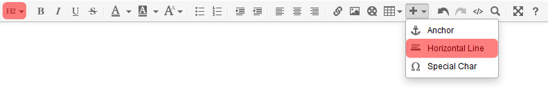
If you’re writing a long article, subheadings are your ticket towards reader engagement.
Readers will often skim articles for subheads and horizontal bars that physically separate your text, and at that point decide when / whether to dig in. This is particularly useful at capturing the attention of skimmers (those who are on the fence between scrolling down or hitting the dreaded back button.)
It’s up to you whether to capitalize the first letter of your heading or the first letter of every word. I personally think that capitalizing the first letter is enough as it makes the text easier to read.
Regardless of what you choose to do, consistency is key. So don’t use...
Initial Capitalization On Some Headings
And not on others.
Highlight and block quote
 |
When laying out paragraphs, a good rule of thumb is to keep them under four sentences in length. When I approach a third sentence, I try to either come up with ways to wrap the paragraph up or introduce a way to space content out. Using highlights and block quotes can really add some much needed breaks while focusing your attention on important phrases, codes or terminology. They are also great ideas for adding a more subtle level of visual separation in your paragraphs that you can’t quite achieve using horizontal rules and subheadings.
|
Divide up heavy concepts with bullets
Lists are a great way to divide up monotonous content. Readers love them as they draw the eye down and force people to read them all the way down.
For that reason bullets are proven to be effective in catching interest and helping users digest concepts easily. Lists are a great way to:
- keep the reader’s attention with you
- make your content look neat and professional
- add some structure to your ideas
- divide up lengthly paragraphs
- give room to expand on your ideas
Organize confusing data with tables and images
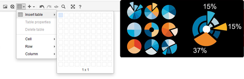
Everyone knows that a picture is worth a thousand words. Similarly, readers see tables as a satisfying way to consume information since tables present complex data in an understandable format.
The Helprace table editor gives you a wide array of options including cell, header and footer formatting as well as the ability to set table dimensions by clicking & dragging. Advanced options can be used to make your tables stand out even more in your articles.
Your Helprace User Portal is designed to be viewed on mobile devices as well as desktops. This means that your text and images are designed to wrap within the display of mobile screens. Although large images or graphs are automatically scaled down to 800px in width in the desktop version of your Helprace, large images or graphs with set widths will not scale down to screens of mobile devices.
Don’t forget to make the most of your visual real estate
Think of your Helprace knowledge base article as your very own piece of real estate. Make sure you use every nook and cranny of your article wisely. Some strategies to maximize the usability of your articles are:
- use language that’s objective, informative and not too jargon or marketing-filled.
- spice up your content with relevant graphics, tables and charts.
- ensure your paragraphs deal with one concrete, concise topic
- have a clear a punchline in the beginning and end of your article.
Follow these guidelines and improve engagement, increase readability and keep your content fresh for longer. Do you have additional ideas or formatting tips to keep readers coming back? Share them in the comment section below!
